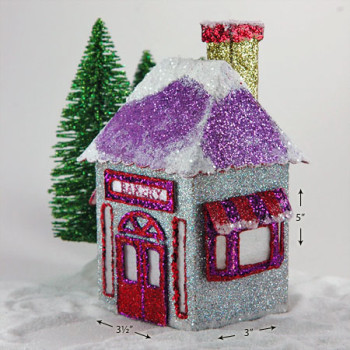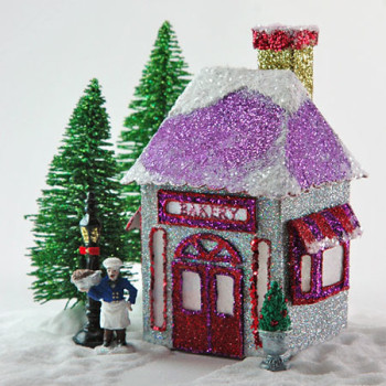
Louie’s Village Bakery
Christmas just isn’t Christmas without delightful cakes, cupcakes, candies and pastries.
I wanted to create a sweet design for this village bakery. And I wanted the baker to be owned by a French boulanger.
Creating the design was a balancing act. I didn’t want it to feel too juvenile or look too feminine, since Louie is neither.
This village bakery, however, could be run by either Louie or Louise, though. That’s the balance I wanted to strike.
One of the more challenging aspects of creating Louie’s was getting the side windows fold easily on cardboard since the dimensions were so small.
I didn’t want to settle for flat windows, though. I think I made about five before finally getting the right fit. Cardstock was too thin and food package cardboard – too thick.
The side windows had to be cut on manilla file folder paper, which proved to be just the right fit. It’s a cross between cardstock and food packaging cardboard.
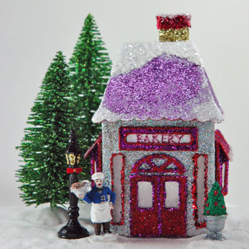
The ‘Bakery’ sign was also a nice little challenge. I wanted it to look light it could light up instead of just looking like a printed sign.
To achieve the detail in the lettering, all I did was dip a toothpick into glue, traced a letter with it and sprinkled on glitter. Of course, after shaking off the excess, I had to go back and fine tune it with my toothpick.
I was pleasantly surprised at how flexible creating the glittered shoppe sign was.
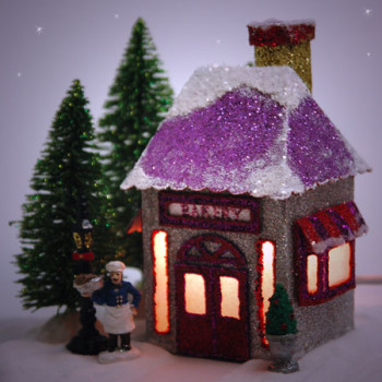
Louie’s Village Bakery is already so sparkly without lighting him up at night, but who doesn’t love a glowing village shoppe in the evening?
The way the main structure is designed allows light to penetrate through the side windows as well as the front.
